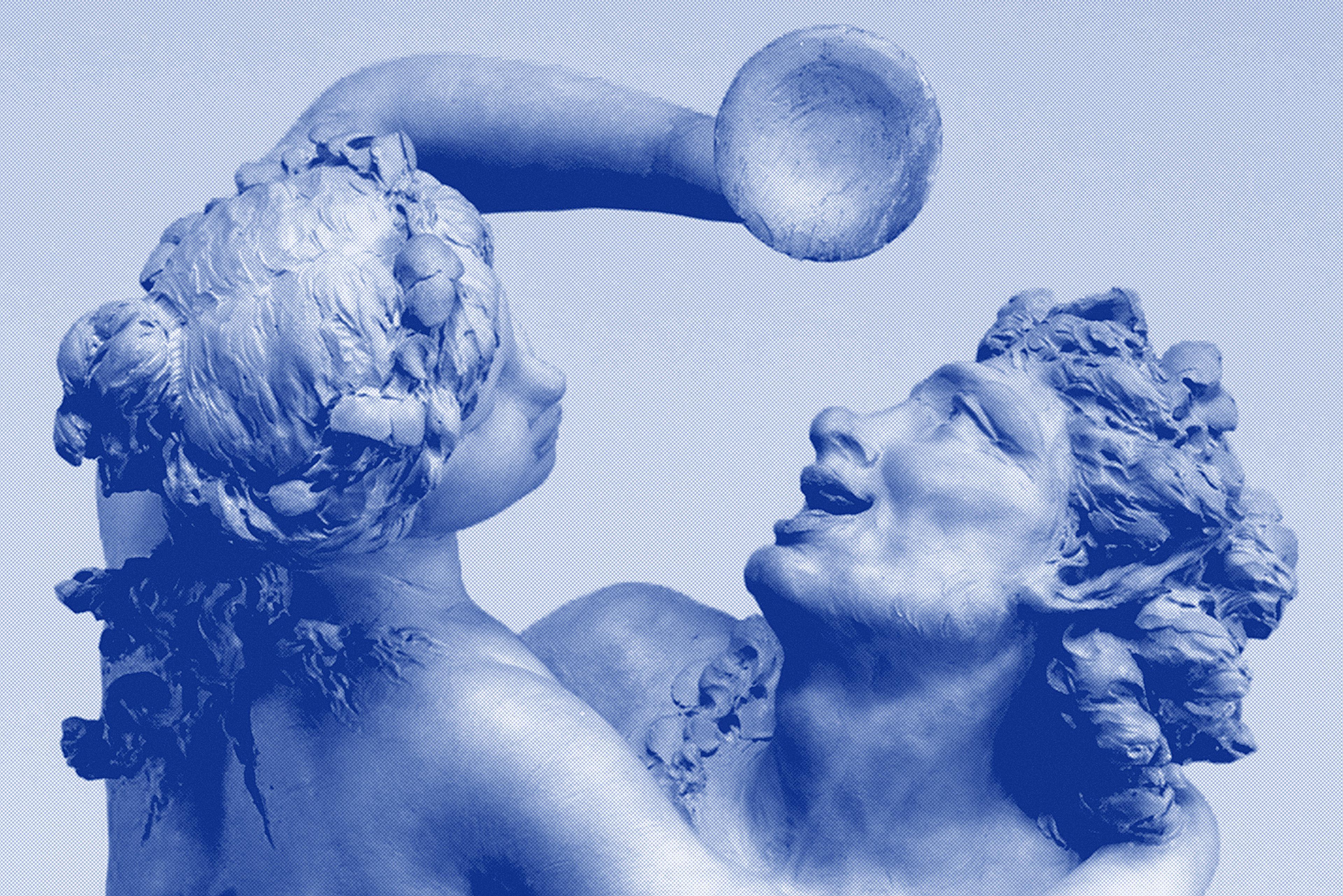
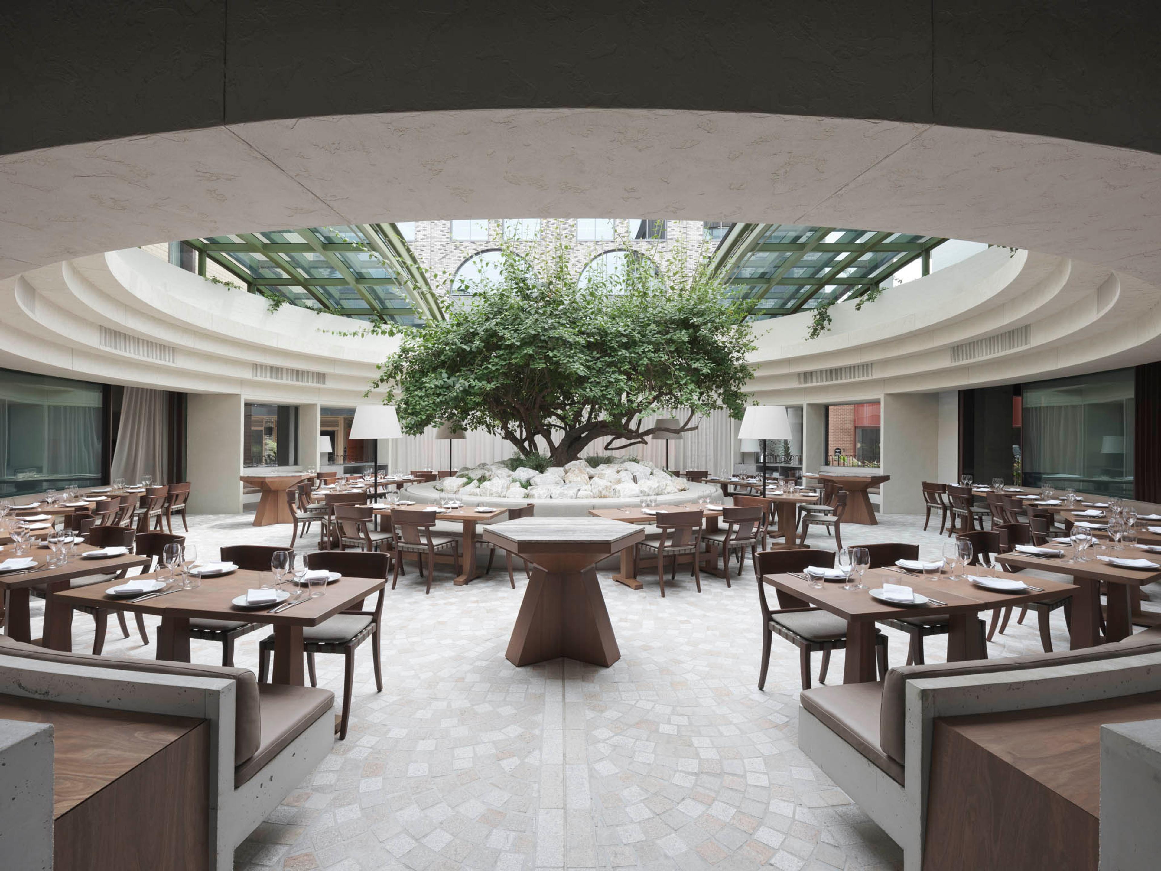
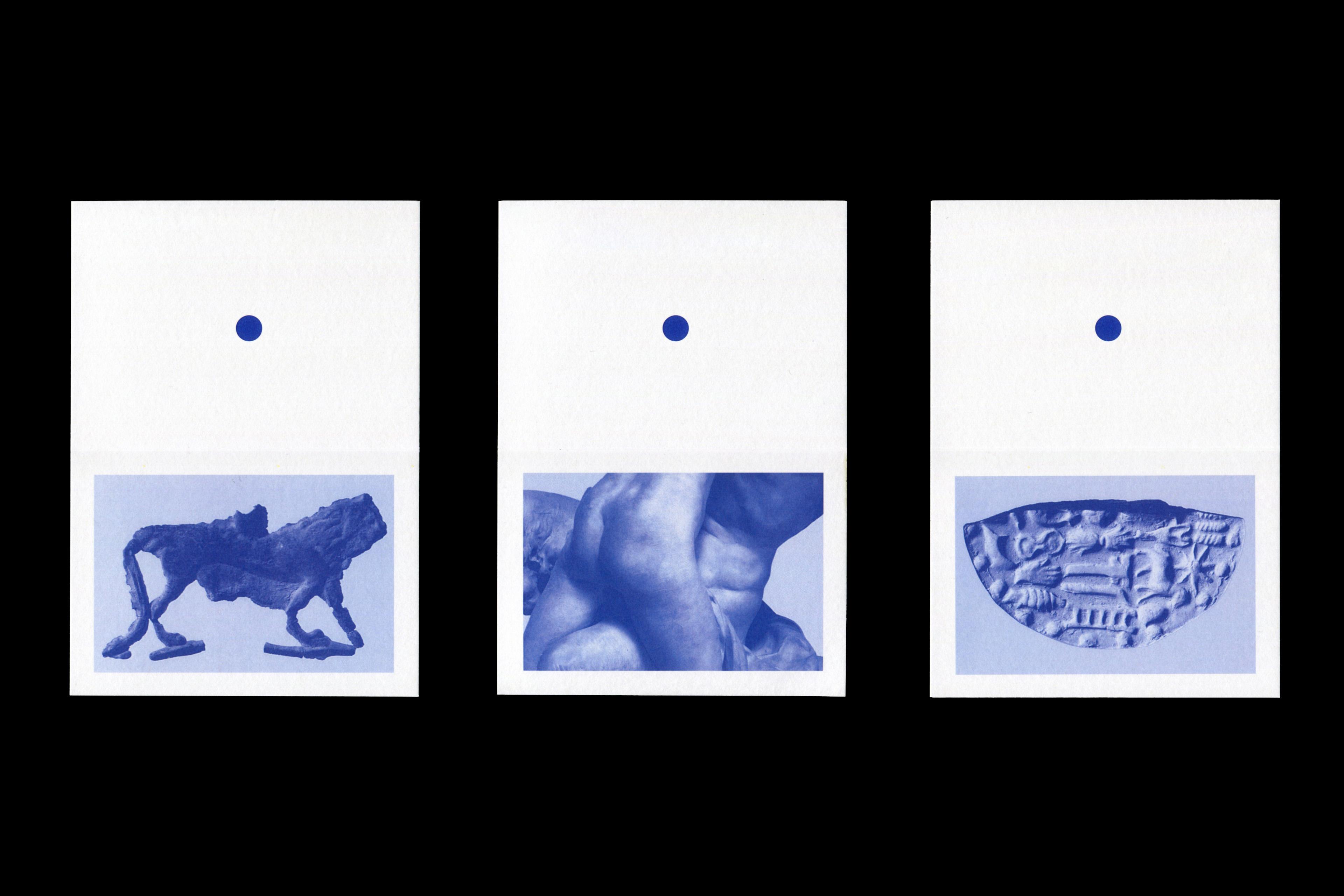
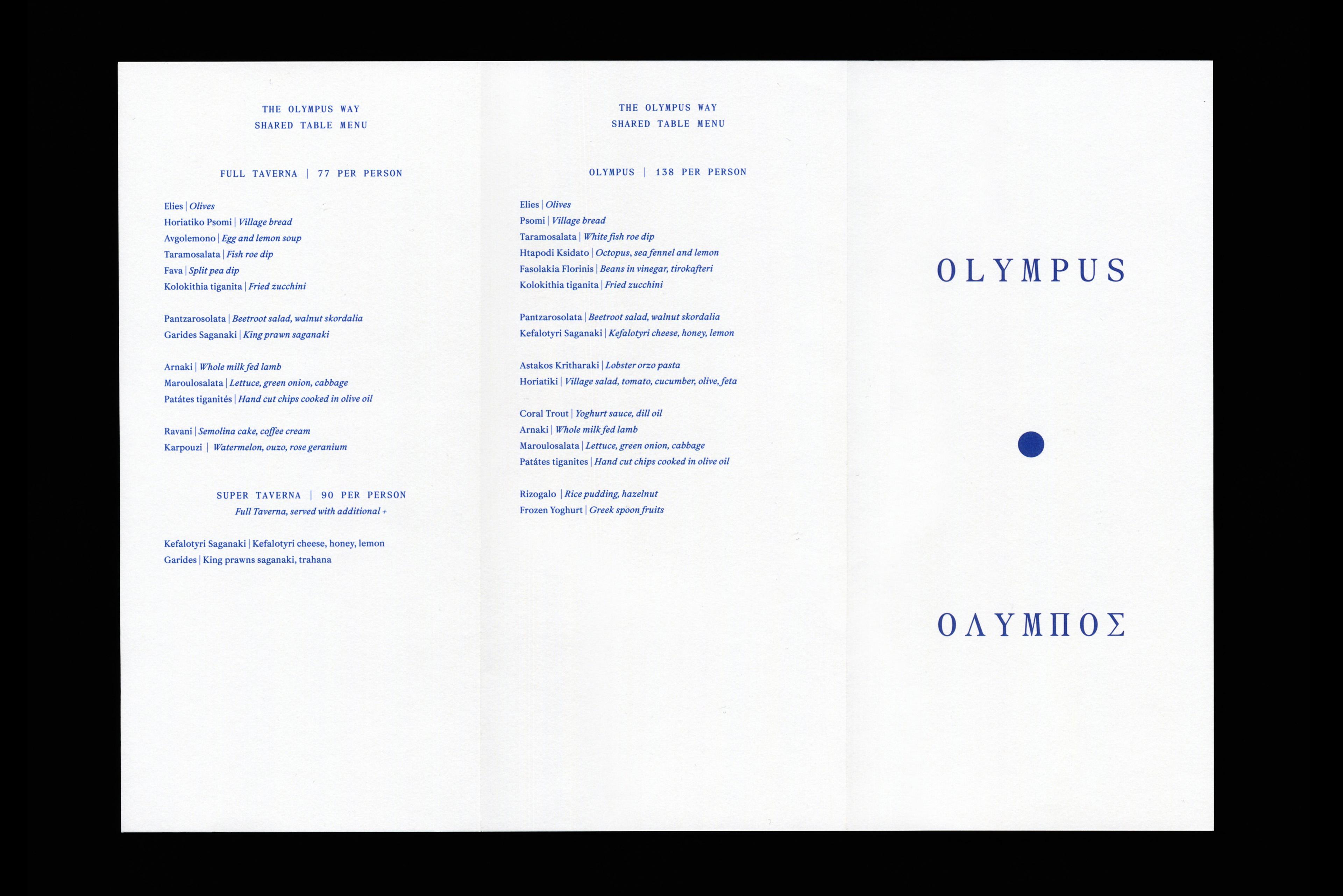
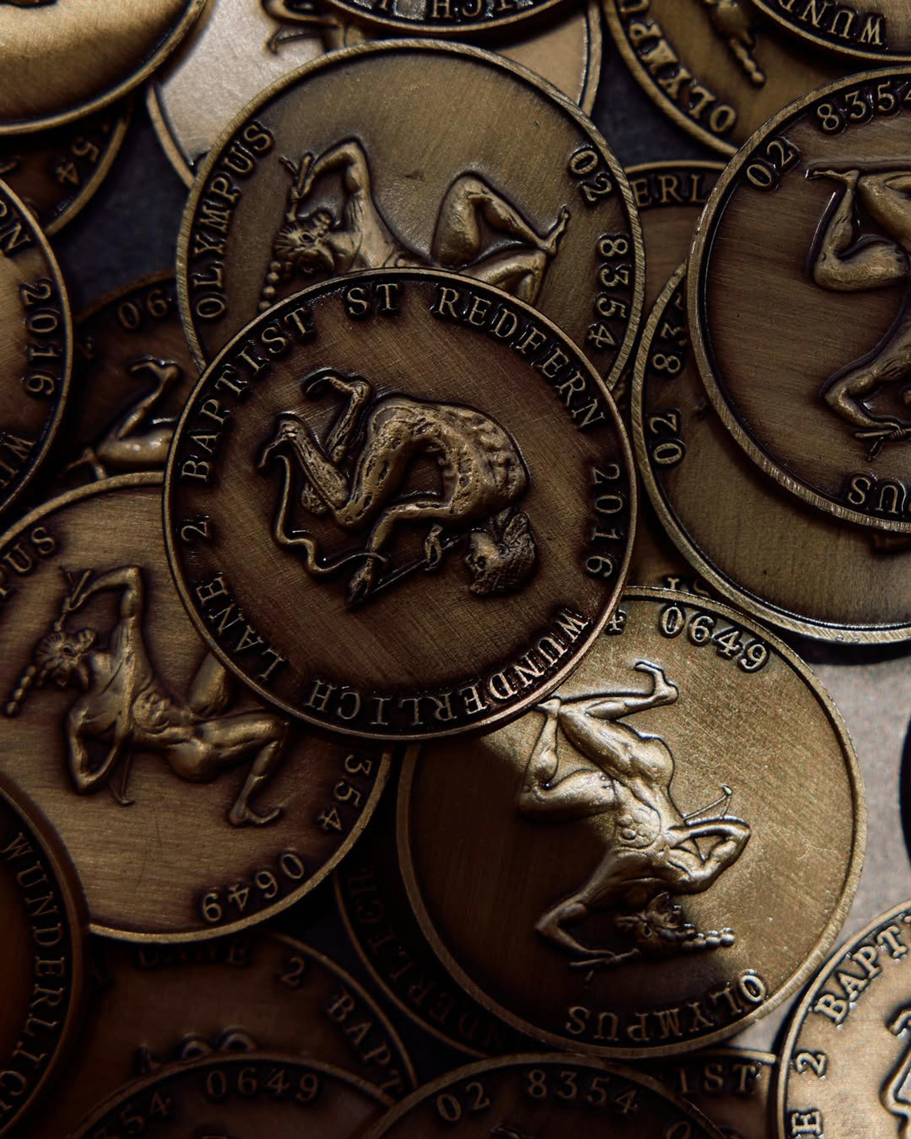
Olympus captures the essence of the Greek taverna while reimagining it through a refined, contemporary lens. The identity draws on the visual language of ancient Greece, combining sculptural forms and classical artefacts with a modern sensibility. These elements are reinterpreted playfully as bold cut-outs, creating a sense of warmth, character, and approachability that balances the sophistication of the typography.
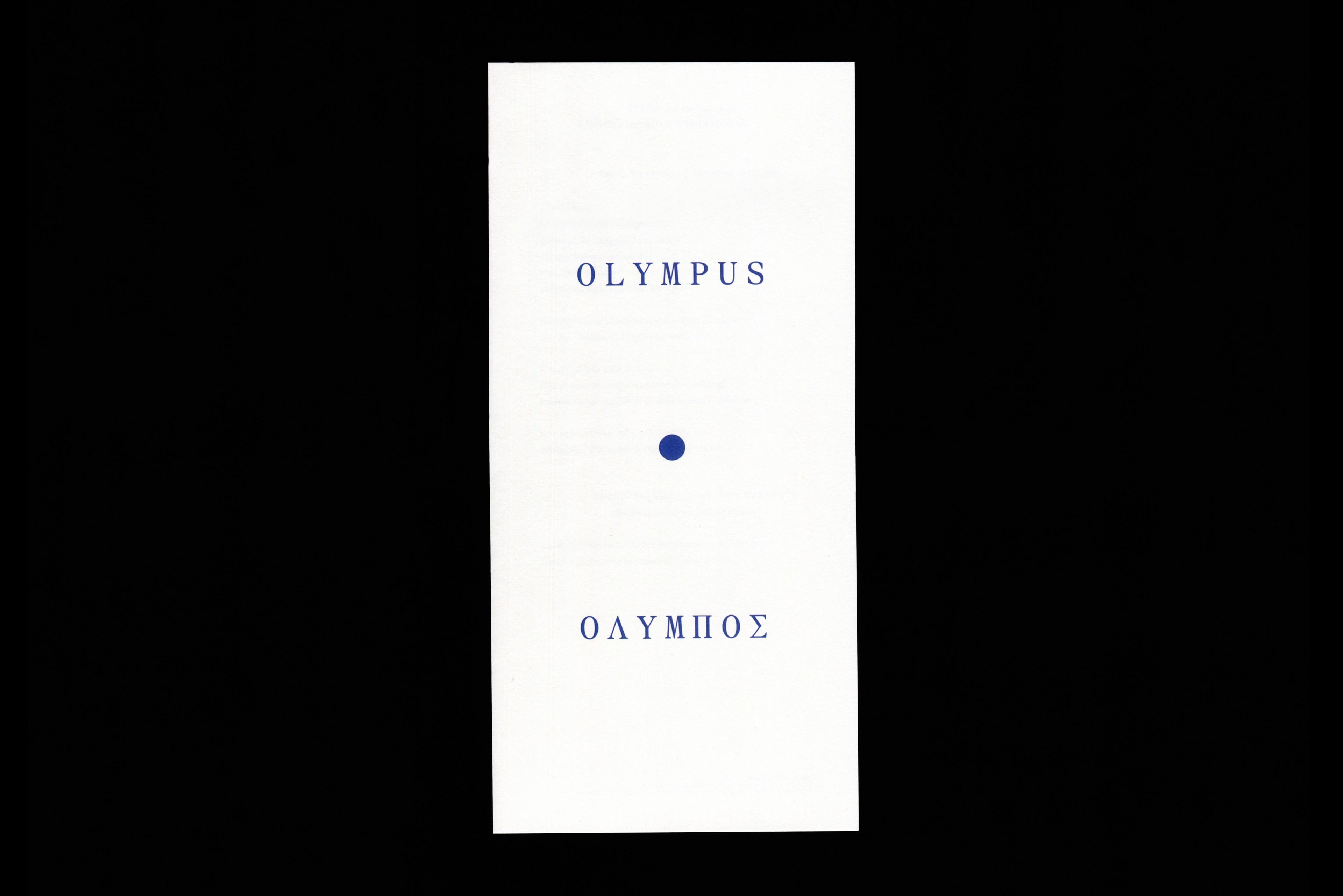
At the heart of the design lies the circle; a symbol drawn directly from the restaurant’s architecture and spatial flow. This recurring motif provides rhythm and cohesion across a range of brand touch points. Paired with a elevated typographic approach and a signature blue palette that evokes the Greek coastline, the brand identity feels elegant yet full of joy.

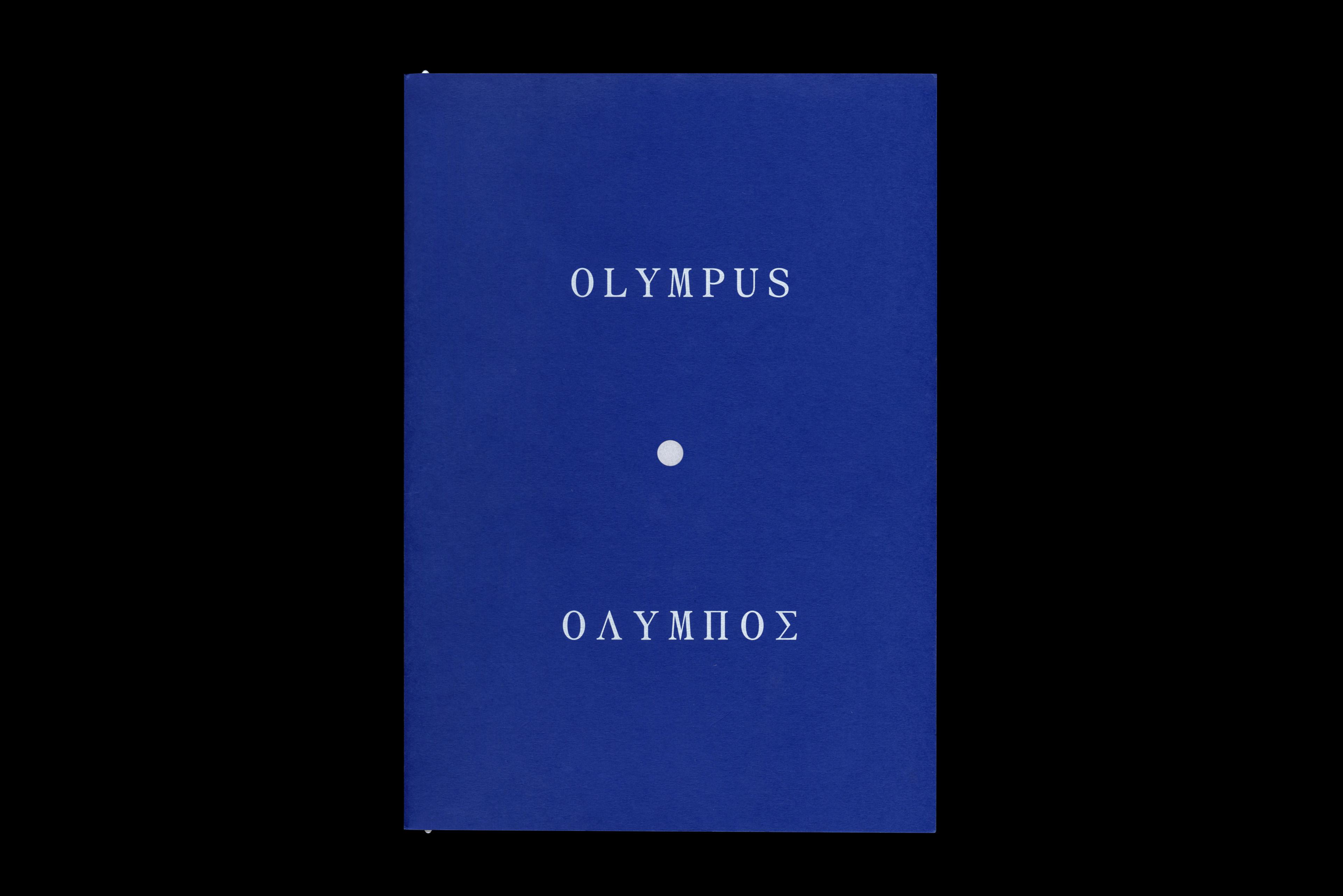
Olympus
Client
The Apollo Group
Website: Liquid Protocol
Photography: Tom Ferguson
Category
Identity
Typography
Culture
Arts
Architecture
Design
M35
Hospitality