As Meta expanded into virtual and augmented reality, its identity needed a level of flexibility and expression the original toolkit had not been designed to support. Working alongside Moniker and Never Sit Still, M35 extended Meta’s existing wordmark, symbol, typography and colour palette into an identity built to move between the real and virtual worlds, rather than simply describe them.
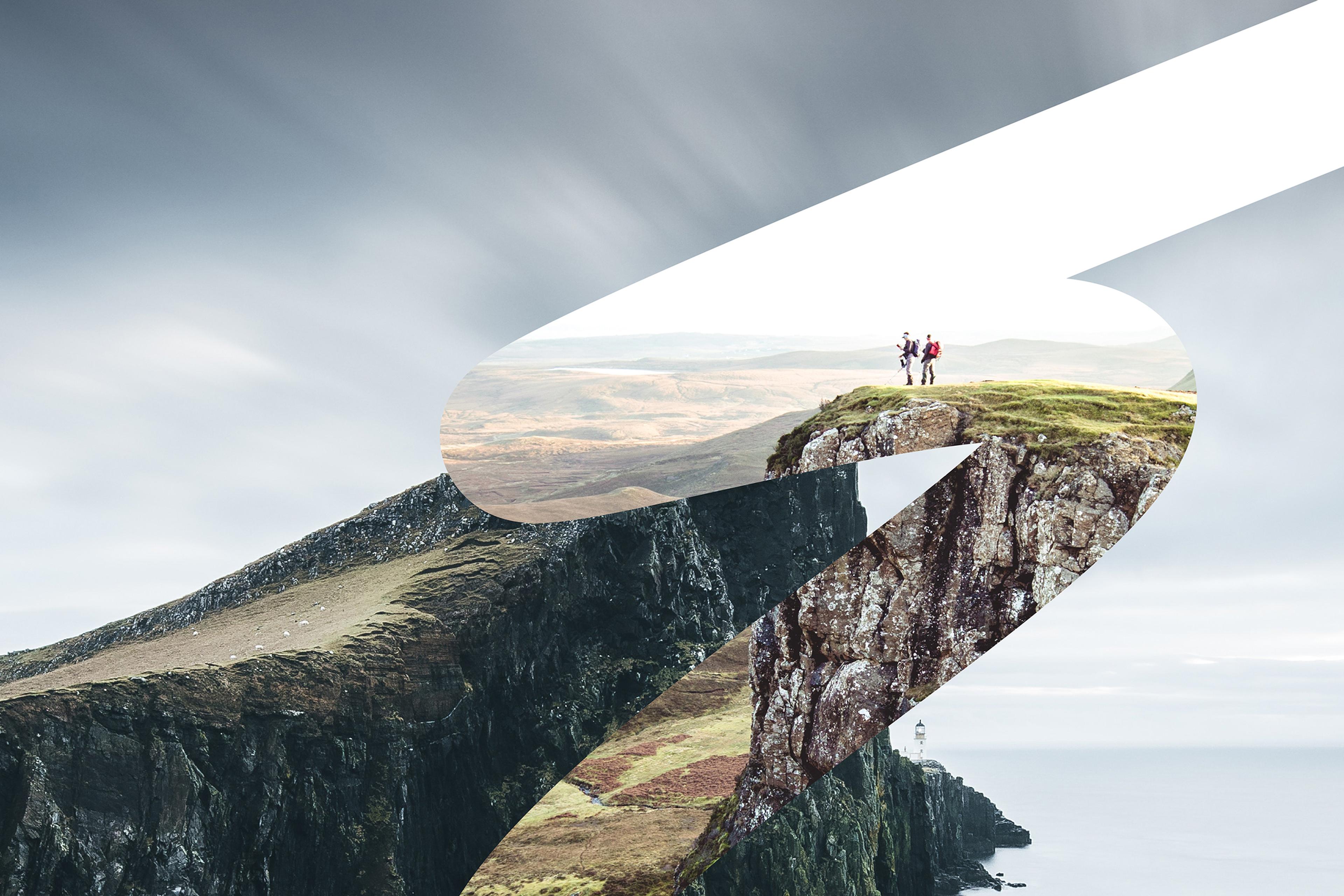
At the centre of the work was the idea of Beyond: the space where physical and digital worlds meet. We began by pushing the existing toolkit into new territory, before bringing it back into a consistent but flexible system for Meta’s internal design teams. A dimensional grid held multiple planes at once; shapes drawn from Meta’s product history became layout devices; and colour could shift in tone without losing its distinctively Meta character.
Motion brought the identity to life. Principles including Linear, Zoom, Expand, Scale, Layer and Shift allowed typography and imagery to move through depth and perspective rather than sit flat on the page. The result is an identity designed to feel native to the world Horizon was built for: flexible enough for everyday product moments, and expressive enough for campaign work.
Meta Horizon
Client
Meta Horizon
Partners
Moniker
Never Sit Still
Category
Campaign
Art Direction
Global
Identity
Outdoor
Typography
Design
M35
Tech
Digital
Motion
Corporate